This page shows an assortment of uniform combinations I mocked up after being disappointed time and again by Nike’s US Soccer uniforms. I enjoy long-sleeve jerseys, so many of the examples I mock up show long-sleeve tops that would simply be cut at the appropriate spot for the short-sleeve version. I also tend to use a crest inspired by the one we wore during the 1950 World Cup rather than the ’90s clipart crest currently used by the US Soccer Federation.
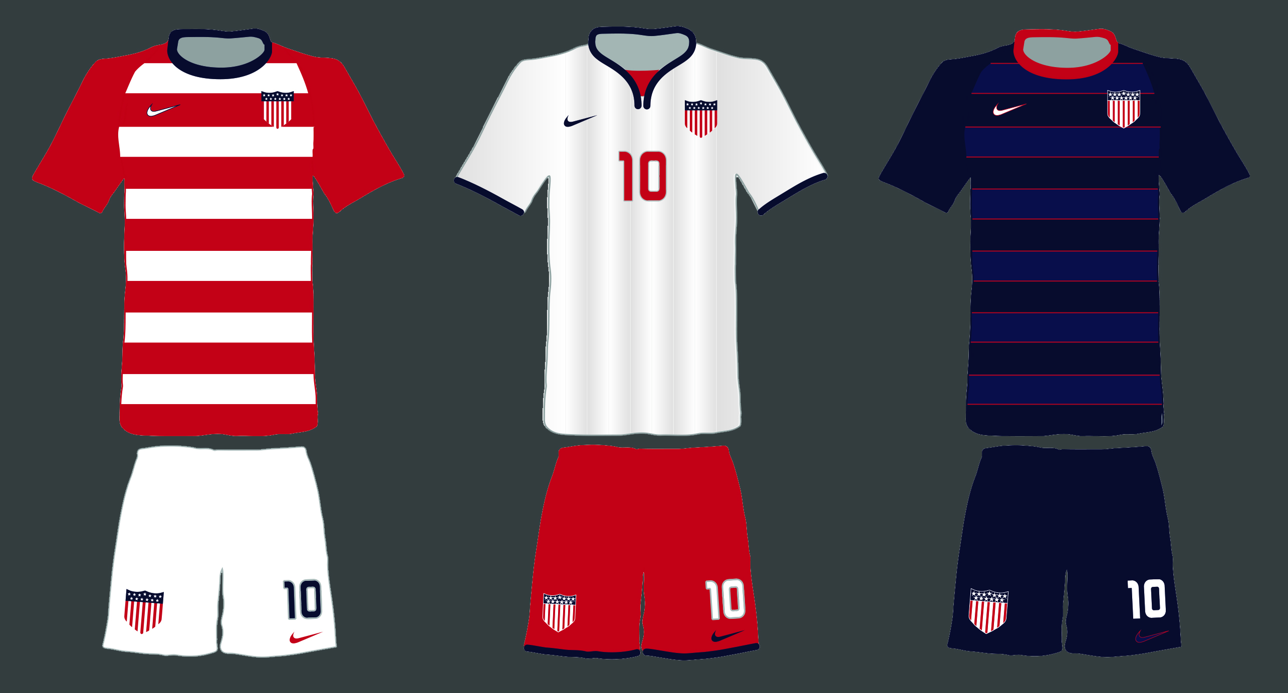
The first set of uniforms draws from the stars and stripes of our flag. One of the things that bothers me most about the US Soccer uniforms Nike has made over the last several years is that each set of uniforms shares no visual motifs with the previous set. US Soccer has no consistent visual identity. Brazil has the yellow and green tops over blue shorts. Mexico has the green tops over white shorts and red socks. Fans of most countries can be instantly picked out in a packed stadium by the colors and patterns that they wear. I believe that US Soccer should draw from the unique features of our flag to create a visual identity. Red and white stripes are instantly visible in a packed stadium, so that would be my first choice. The Home, Away, and Third uniform options below include uniforms for both an outfield player and a goalkeeper as well as a training top.
Home
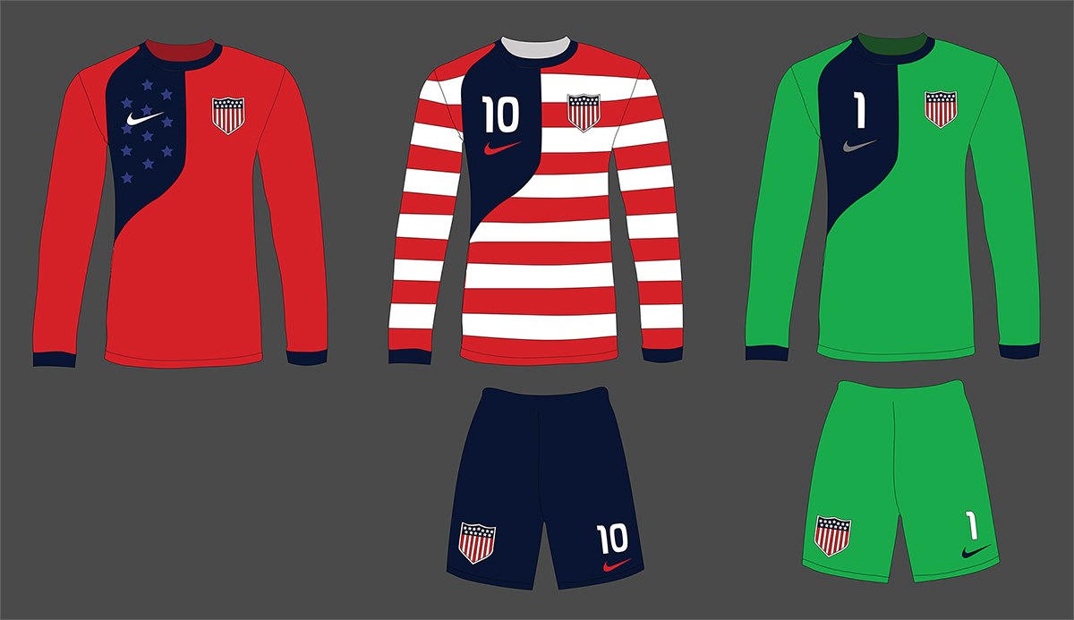
Away
Third
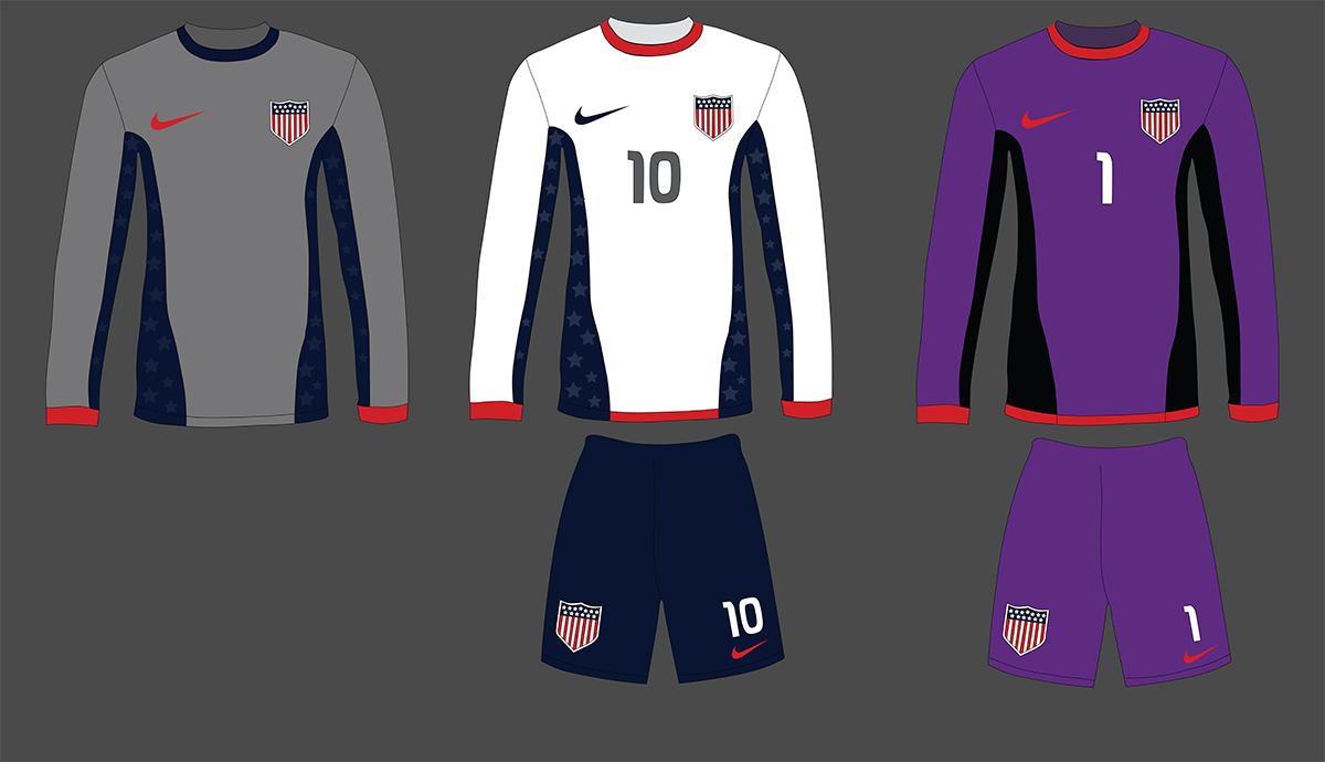
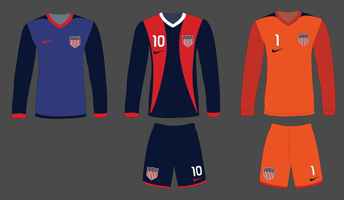
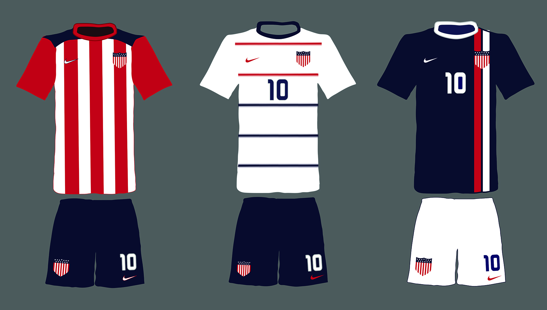
These two sets are more quick mock-ups I made that draw from various features of previous US Soccer or Nike club team jerseys that I thought could work for US Soccer.
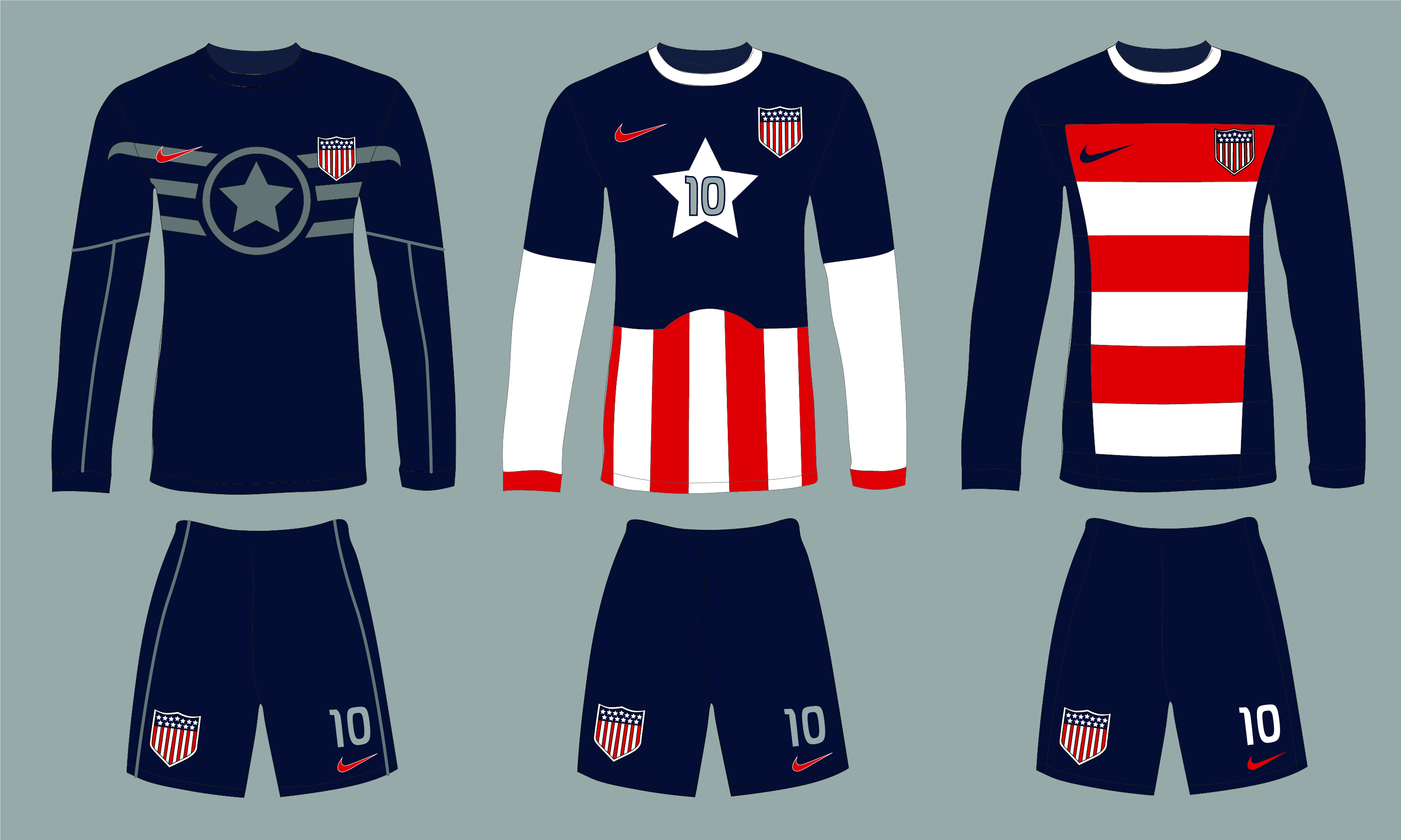
Just for fun, I tried to think of the most obnoxious uniform idea I could. I wanted something that would call to mind all of the stereotypical ‘Murican traits that we embrace as part of our American Exceptionalism. I wanted something that basically tells our opponents throughout the world that our eventual rise to greatness in soccer is just an extension of manifest destiny. So I made three uniforms that draw from Captain America’s uniforms from various eras of the comic book series and movies.